My favorites CPS charts
The questions come often as to what charts are the most useful or "how can I see this or that". So, I thought that I might take a moment and show off some of the charts that can be found on my
athlete home page. Let me preface by stating that I am not a coach. And, I'm not a particularly good athlete. But, I do have a pretty decent understanding of training methods and tools.
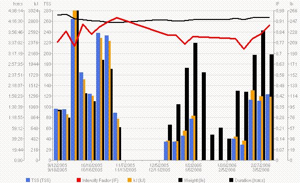
The chart to the right displays my weekly TSS (total stress score) along with the actual duration of workouts for the week. The red line indicates the average IF (intensity factor) of my cycling workouts. The black line on top indicates my weight.
You will notice mid-way through the chart, the black bars (duration) become taller than the TSS. This is due to a return to running.
The chart itself is used to monitor my progression of training stress. That is, as I return to training regularly, I can use the chart to make sure that I am adding training stress in a controlled manner.
 Like any cyclist, I want to know whether or not I am improving. It's not all about spending alot of time riding. It's about being able to see improvements. The chart on the right shows my Mean Max Power for various timeframes on a week by week basis. It doesn't tell me whether I've grown stronger, per se. It tells me that I've touched certain levels during the week. If I see that a certain level hasn't gone up in a while, then I'll make an attempt to hit it during the upcoming week or as soon as my training schedule allows.
Obviously, I have more charts and metrics that I put on my athlete page. But these are two of my favorites.
posted by jeffh @ 12:46 PM
![]()
![]()


<< Home